Andrew
Walpole
Principal Web
Developer &
Engineering
Manager
Designer
Leader
Teacher
Learner
Maker
Custom Top and Bottom CSS Container Masks
Here’s the use case: You have a design where the top and/or bottom section of a website has a custom shape defining its transition to the container before and/or after it. Essentially, it’s a shape mask on the top or bottom of the container with the actual content in the section sandwiched in-between.
Well it turns out that a lot of the methods out there to achieve this effect are pretty old, quite involved, and come with a lot of limitations. Thinking, there must be a better way, I set out to figure it out.
I started by consulting the Shop Talk Discord’s #help-desk to see if anyone had any thoughts. We mused a bit about clever border-radius settings and svg clip-path a bit, but I finally got the spark I needed when Hussein Al Hammad shared a very promising demo using multiple mask-image definitions!
It was really a TIL for me that mask-image supported multiple image definitions, similar to background, and that was exactly what I needed to formulate an idea for this CSS trick.
The Masking Methodology
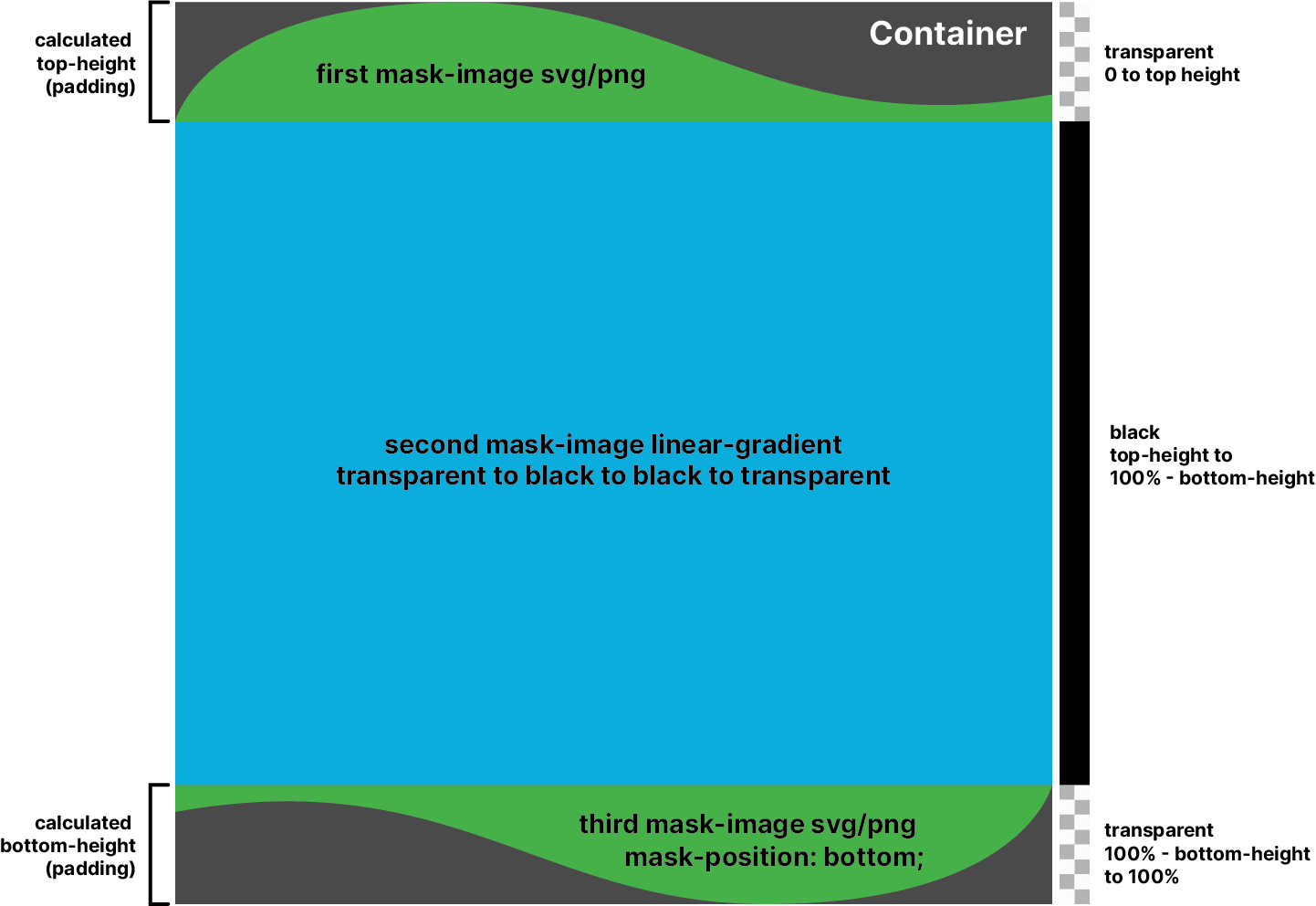
The concept is involved, but not overly complex:
- Apply a
mask-image(svg or png) to mask the top of the box. - Use the ratio of the width and height of the mask image to calculate the mask height based on the viewport or container width.
- Apply a second mask with a linear gradient that starts at the first mask’s height and ends at the bottom mask’s height.
- Apply a third mask to the bottom of the container with the exact same methodology as the top.
- Use the top and bottom heights to create padding and negative margin on the box.
- As a bonus, if you use a container to store your css variables, you can use the calculated mask heights to apply a padding to the containers above and below the masked box.
One thing to note is that if you’re dealing with full-width containers for this effect, you can use vw units in your calculations. But in the following example, I opted for the newer cqw units and defining container-type: inline-size; on the parent of the .mask-box which lets you use this concept on containers less than full viewport width! The great thing is that cqw units are equal to vw units when not within a container.
The .mask-box Code:
.mask-container, .mask-box {
  /* The image used as a mask for the top of the container */
  --top-mask-image: url('data:image/svg+xml,<svg xmlns="http://www.w3.org/2000/svg" viewBox="0 0 1000 100"><path d="M0,100S32.06,0,326.72,0c255.72,0,358.35,119.2,673.28,77.47v22.53H0Z"/></svg>');
  --top-mask-image-height: 100; /* The width of the top mask image */
  --top-mask-image-width: 1000; /* The height of the top mask image */

  /* Calculate the height of the top mask */
  --top-mask-height: calc( ( var(--top-mask-image-height) / var(--top-mask-image-width) * 100 ) * 1cqw - 2px );

  /* Define all the same for the bottom */
  --bottom-mask-image: url('/static/blog/css-masks/swoop-bottom.svg');
  --bottom-mask-image-height: 100; /* The width of the bottom mask image */
  --bottom-mask-image-width: 1000; /* The height of the bottom mask image */

  /* Calculate the height of the bottom mask */
  --bottom-mask-height: calc( ( var(--bottom-mask-image-height) / var(--bottom-mask-image-width) * 100 ) * 1cqw - 2px );
}

.mask-container {
  /* Define a container to use cqw instead of vw units */
  container-type: inline-size;

  /* Added bonus: apply padding to container above the .mask-box equal to the negative margin */
  & div:has(+ .mask-box) {
    padding-block-end: var(--top-mask-height);
  }

  /* Added bonus: apply padding to container below the .mask-box equal to the negative margin */
  & .mask-box + div {
    align-items: start;
    padding-block-start: var(--bottom-mask-height);
  }
}

.mask-box {
  /* Apply negative margin to the top and bottom */
  margin-block: calc( -1 * var(--top-mask-height) ) calc( -1 * var(--bottom-mask-height) );

  /* Pad the container so content doesn't hit the masks */
  padding-block: var(--top-mask-height) var(--bottom-mask-height);

  /* Apply the three masks! */
  mask-image: var(--top-mask-image),
              linear-gradient(transparent var(--top-mask-height), black 0%, black calc( 100% - var(--top-mask-height)), transparent calc( 100% - var(--bottom-mask-height)) ),
              var(--bottom-mask-image);
  mask-repeat: no-repeat;
  mask-position: top, top, bottom;
  mask-size: 100%, 100%, 100%; /* You may need to increase the width to 101% on the svg masks to compensate for strange sizing behavior in Firefox */
}
Rather than piece it together bit by bit, here is the whole thing! I tried to comment each relevant item. A few things to note though:
- The sibling selectors that add padding to the containers above and below the
.mask-boxaren’t required, but it does help if you don’t want to guess or hardcode at where you need to have content stop before it underlaps the mask. - The masks themselves can be any image, but I find
svgeither inlined or referenced as a file to be quite good. Forpngimages, any transparency in the file will not be part of the mask. The pngs will also tend to get fuzzy as they scale up.
With the CSS above, you can use your .mask-box like this:
<div class="mask-container">
  <div>
    <span>The Content Above the Effect</span>
  </div>

  <div class="mask-box">
    <h3>I am a .mask-box</h3>
  </div>

  <div>
    <span>The Content Below the Effect</span>
  </div>
</div>I am a .mask-box
Creating Masks
Once this pattern is in place, creating masks is very easy! You can really use any image, though I may recommend a pretty wide sizing ratio, as the mask scales proportionally and may get quite tall on wide screens. For my demos I found a 1000px by 100px sizing was nice!


You can easily create sets of classes to apply the new images and sizing:
.flags-top {
  --top-mask-image: url('/static/blog/css-masks/mask-flags.svg');
  --top-mask-image-height: 100;
  --top-mask-image-width: 1000;
}

.tent-bottom {
  --bottom-mask-image: url('/static/blog/css-masks/mask-tent-bottom.svg');
  --bottom-mask-image-height: 100;
  --bottom-mask-image-width: 1000;
}I am a .mask-box


.name-top {
  --top-mask-image: url('/static/blog/css-masks/mask-name-top.png');
  --top-mask-image-height: 100;
  --top-mask-image-width: 1000;
}

.name-bottom {
  --bottom-mask-image: url('/static/blog/css-masks/mask-name-bottom.png');
  --bottom-mask-image-height: 100;
  --bottom-mask-image-width: 1000;
}I am a .mask-box
And that’s it! This is definitely a CSS trick, but not one that is too overly complicated, especially in comparison to other methods out there. I also like how robust it is. The masks scale responsively very well, and can be varied in size and complexity. You can even use transparent to black gradients on png masks to achieve some interesting fade effects. If you use this technique I would love to see what you do with it, I’m sure it can be pushed even further!